


Color is all about aesthetics, feelings, functionality, and flow. The right color palette can elevate a room, create a sense of space and even boost your mood. Especially when planning an Edmonton home redesign, the colors you choose will define the atmosphere for years to come
Edmonton experiences significant seasonal changes, from dark, chilly winters to radiant summer days. This makes choosing interior colors in Edmonton a unique challenge. You need a palette that adapts seamlessly to variations in natural light and seasonal moods..
A thoughtful Edmonton home color palette doesn’t just look beautiful but it also reflects your personality while aligning with practical considerations like lighting, layout, and architecture.
If you’re just starting your design journey, you might find our guide on what to expect during your first home design consultation in Edmonton very insightful.
Now, let’s walk through the key steps to choosing the perfect color palette that will bring your Edmonton home redesign to life.
- Understanding Edmonton’s Natural Light and Seasonal Effects
Winter’s low, diffused light can make colors look duller and cooler, while summer’s bright rays can wash out subtle hues. When selecting paint colors for Edmonton homes, keep these shifts in mind to ensure your choices remain vibrant year-round.
Choosing Colors That Work in Both Low Winter Light and Bright Summer Days
- Warm neutrals like taupe, creamy whites, and soft greiges stay cozy and inviting in low light.
- Muted greens and earthy tones help maintain vibrancy without overwhelming the space.
- Avoid overly cool grays that can feel sterile during long winters.
For more ideas on emerging trends, check out our blog on top colors of the year by leading paint brands.
- Start with a Base Color That Reflects Your Home’s Style
Whether your home is modern, rustic or traditional, your color palette for home renovation should enhance its inherent style:
- Modern Homes: Crisp whites, charcoals, and dramatic contrasts.
- Rustic Homes: Warm browns, soft greens, and natural stone shades.
- Traditional Homes: Timeless creams, navy blues, and elegant burgundies.
Neutrals vs. Warm Tones vs. Cool Tones
- Neutrals create versatile backdrops.
- Warm tones (like terracotta or golden beige) make spaces feel cozy.
- Cool tones (such as icy blues) bring a sense of calm but must be used thoughtfully considering Edmonton’s winter light.
3. Identify a Focal Point or Feature to Inspire the Palette
- Using Art, a Fireplace, or Flooring as a Color Anchor
In regional color palette selection, anchoring your design around a standout feature ensures cohesion. An heirloom rug, a stone fireplace, or stunning hardwood floors can dictate the primary tones of your palette.
- Building Supporting Colors Around One Key Element
Once you pick your anchor piece, draw out complementary shades. Use lighter tones for walls and bolder hues for accents to maintain tonal harmony.
4. Use the 60-30-10 Rule for Balanced Design
The 60-30-10 rule is a fundamental guideline for design cohesion:
- 60%: Dominant color (walls, large furniture)
- 30%: Secondary color (upholstery, rugs)
- 10%: Accent color (decor, pillows)
Sample Palettes for Living Rooms, Kitchens, and Bedrooms
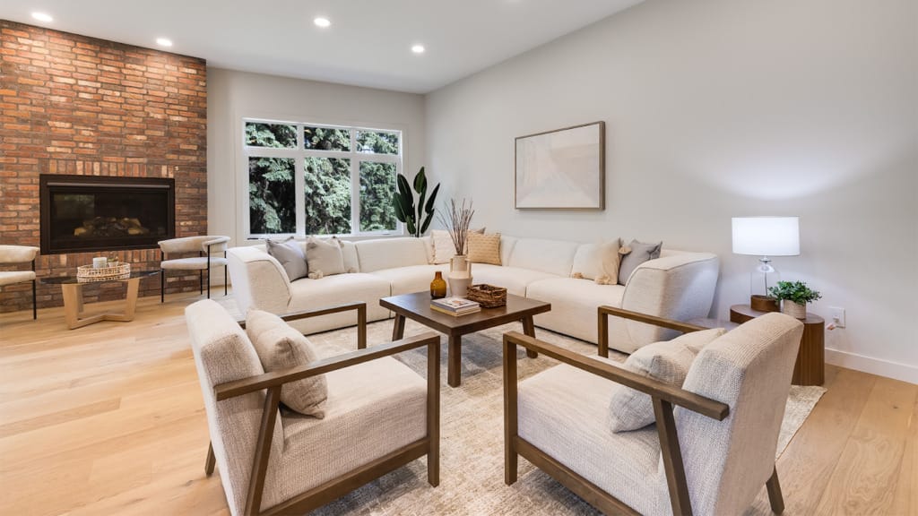
- Living Room: Warm beige (60%), muted navy (30%), burnt orange (10%)
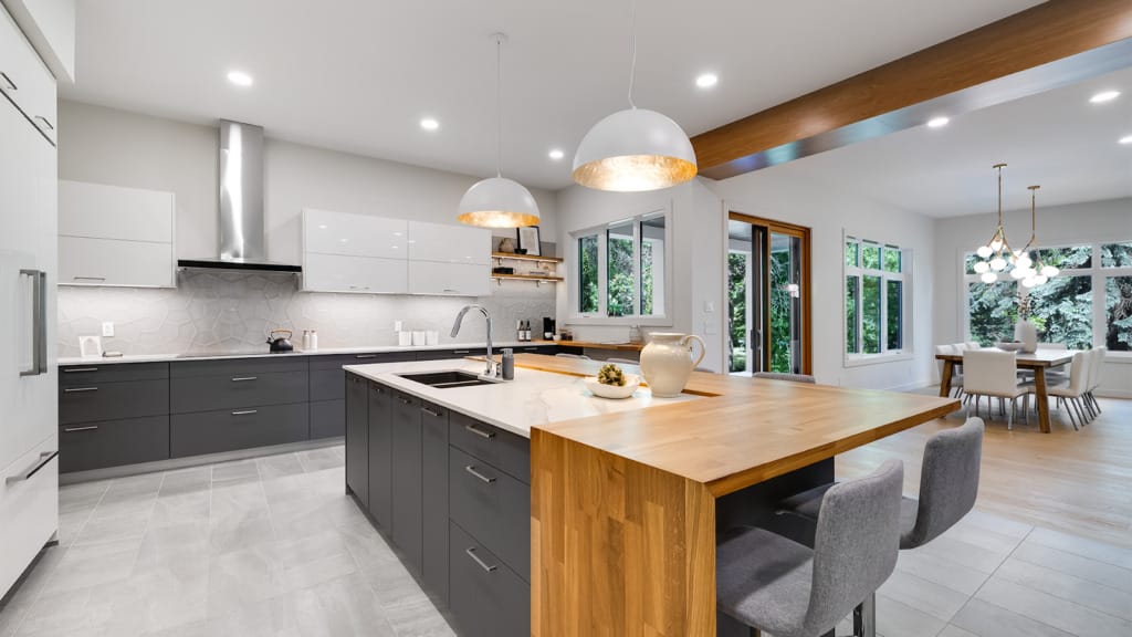
- Kitchen: Soft sage (60%), creamy white (30%), brushed gold (10%)
- Bedroom: Dusty rose (60%), warm gray (30%), deep plum (10%)
For more design strategies, visit our expert tips for a successful home redesign in Edmonton.
5. Regional Color Trends Popular in Edmonton Homes
Popular Paint Brands and Color of the Year Picks
Benjamin Moore, Sherwin-Williams, and Behr consistently release “Color of the Year” picks that greatly influence color trends in Edmonton. For example, earthy terracottas and sophisticated greens have been major hits recently.
Local buyers favor colors that offer flexibility, think misty blues, muted sages, and off-whites with warm undertones. If you ever plan to sell, emphasizing regional preferences makes your space more appealing.
Discover more about why home design matters when considering your color choices.
6. Test Paints Before Committing
Color can dramatically change based on light exposure. A warm beige might look sunny in a south-facing room but turn muddy in a north-facing one. Seasonal lighting impact is crucial when planning an Edmonton home color palette.
Using Paint Swatches and Samples Strategically
- Paint large poster boards and move them around the room.
- Test during different times of the day.
- Don’t skip observing colors during winter evenings and summer afternoons.
7. Tips for Creating Flow from Room to Room
Coordinating Tones Without Being Monotonous
Flow doesn’t mean every room must be painted the same. Stick to consistent undertones (either warm or cool) across your palette to allow variation without discord.
Using Accent Walls and Transition Spaces Effectively
- Accent Walls: Great for highlighting fireplaces or headboards. Ensure accent colors complement the room’s main palette.
- Transition Spaces: Hallways and entryways should subtly bridge different color schemes using softer versions of the adjacent room colors.
Understanding color zoning helps balance transitions, preventing jarring shifts.
8. Avoiding Common Color Mistakes
Overuse of Bold Colors
While a vibrant accent is fun, an entire room painted in a high-energy color can overwhelm. Reserve bright, bold shades for small doses.
Mismatched Undertones
Mixing warm and cool undertones without intention leads to visual chaos. Always align the temperature of your palette for true tonal harmony.
Ignoring Floor and Ceiling Colors
Ceilings painted in bright white may clash with warmer wall tones. Similarly, existing wood, tile, or carpet flooring must blend with your chosen shades.
If you’re feeling unsure about how to modernize your color choices, explore how home design consultants in Edmonton help modernize homes.
Conclusion
Choosing the right Edmonton home color palette is more than a trend—it’s about creating an environment that reflects you and fits Edmonton’s unique climate and lighting.
By understanding undertones, utilizing accent walls strategically, embracing the 60-30-10 rule, and keeping regional preferences in mind, you’ll craft a cohesive, timeless design. Always test your choices in real light, remember the importance of design cohesion, and don’t be afraid to seek professional advice when needed.
Color has the power to transform. With thoughtful planning and a little creativity, your Edmonton home redesign will not just look stunning—it will feel like home.
Need more personalized advice for your Edmonton home redesign? A professional color consultation could save you time, stress, and costly mistakes. Start your journey with confidence and color!